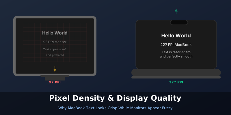
You buy a Full HD (1920×1080) monitor and check the specs. Your MacBook also outputs to a similar resolution. Yet when you start working, the text on the monitor looks noticeably softer. Not broken or unreadable — just not as sharp as what you see on your MacBook’s built-in screen. What’s going on?
The answer isn’t about resolution numbers. It’s about pixel density.
The Pixel Density Problem
Here’s the thing: two displays with the same resolution at different sizes will have completely different pixel densities [1]. A 24-inch Full HD monitor has roughly 92 pixels per inch (PPI) [2]. Your MacBook Air? Try 227 PPI [1]. Your 16-inch MacBook Pro? 254 PPI [1].
That’s not a small difference. That’s a nearly 3× difference in how many pixels are crammed into the same physical space.
At 92 PPI, your eye can actually see individual pixels if you look closely. At 227+ PPI, you cannot. Apple designed macOS to be comfortable and legible at around 218 PPI for desktop displays [1]. Stray too far below that, and the OS becomes visually degraded — even if the resolution numbers sound identical.
Why Text Rendering Changes
This is where it gets interesting. Text isn’t rendered as bitmaps anymore. It’s rendered using curves that get antialiased — smoothed to look less jagged [1].
But antialiasing comes in flavors, and the flavor depends on pixel density.
On low-PPI displays (like your 92 PPI monitor): the system used to rely on subpixel antialiasing [2]. This exploits the physical geometry of LCD screens — the red, green, and blue subpixels — to fake extra sharpness. It’s a trick that made fonts look acceptable on older, lower-density displays [2].
On high-PPI displays (like your MacBook): the system uses grayscale antialiasing instead [2]. It smooths fonts using shades of gray, not color tricks. At high density, this approach produces much sharper, thinner letterforms that look almost printed [3].
Here’s the kicker: macOS Mojave removed subpixel antialiasing by default [2]. Apple decided that on Retina-class displays, the older trick was unnecessary. But on non-Retina monitors? The loss of subpixel rendering made text look noticeably softer [2].
The Scaling Trap
Even worse, macOS scales UI elements when you use a lower-density external monitor. At 100% scaling on a 92 PPI display, everything should theoretically be sharp. But in practice, applications render at a higher logical resolution, then downscale to fit the physical pixels. This introduces subtle blurriness — especially in scrolling and animation [4].
At 125% or 150% scaling, the math doesn’t work out cleanly [5]. The renderer has to interpolate somewhere, and you end up with fractional pixels that blur text [5].
What You Actually Need
If you’re considering a new monitor for a Mac, pixel density matters far more than the raw resolution number.
For a 24-inch monitor, 1920×1080 gives 92 PPI — workable but not great. A 27-inch 4K display (3840×2160) gives 163 PPI [2] — noticeably sharper. Ideally, you want 160+ PPI for text-heavy work [2].
This is why many developers and designers pair their MacBooks with 27-inch or 32-inch 4K monitors or even 5K displays [1]. Not because higher resolution is always better, but because at those screen sizes, the pixel density climbs into the range where grayscale antialiasing produces genuinely crisp text [3].
The Workaround
Can you improve text on your Full HD monitor without buying a new one? Slightly.
In macOS System Settings → General, you can enable Font Smoothing (though Apple notes this is mainly for non-Retina displays) [1]. Some users report that tweaking this setting helps, but it won’t replicate the sharpness of a high-PPI display — it’s a band-aid, not a fix.
The real solution is accepting that lower pixel density requires different rendering trade-offs [3]. Your Full HD monitor isn’t broken. It’s just operating in a pixel density range where the human eye starts to notice softness.
End
Sources
- Explainer: Pixel density and display resolution – The Eclectic Light Company
- The subpixel-AA debacle and font rendering | MacRumors Forums
- The Impact of Retina Displays On Fonts – Zit Seng’s Blog
- macOS, blurry texts on an external Full HD monitor? | Medium
- Why Text Looks Blurry at 125% or 150% Display Scaling | KTC Play